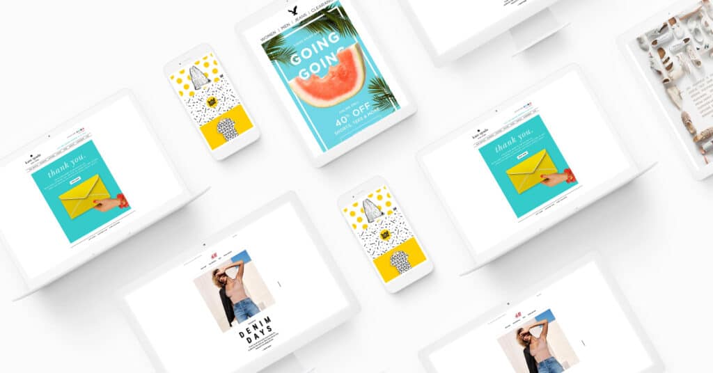
We have entered into a new year AND a new decade where the email-design innovations are endless. In this blog post, we’re highlighting some of the top trends that are projected to take off in 2020, and how you can use them in your current email strategy.
The Rise of Dark Mode
The attempts to combat the effect of blue light have brought about the rise of dark mode, which changes the coloring of the email interface so that the content is presented in high contrast on a dark background. This shift from light to dark has become so popular, that the shift often happens without any prompting. Apple Mail and Outlook have already made the switch, with other major emailers not far behind. Dark mode is one of the best practices for accessibility, as the layout, colors, font, and placement of the information in a way that subscribers can easily access it.
Incorporate 3D Visuals
Visual elements are an important part of any email, and that is something that won’t change in the years to come. In 2020, expect to see a rise in 3D visuals, which can lead to an increase in subscriber engagement. Enhanced visuals not only convey the message of an email more effectively, but they also help to build confidence in the subscriber’s mind, leading them to make that decision to buy.
Interactivity
Interactivity can extend far beyond 3D visuals, they also can be used is a way that they do not need any involvement from the subscriber. Not only does it add another layer of delight to your email, but it also enhances its’ overall performance, which in turn reduces the unsubscribe rate. One of the newer forms of interactivity that has been popping up in emails is gamification, which allows users to play a game within the body of the email where they can win discount codes or other incentives.
Unconventional Layouts
2020 will be the year that marketers break the mold when it comes to email layouts. Gone will be the traditional grid-like layout with the standard features, instead, look for layouts that introduce broken grids and information presented in a non-linear format.
Funky Fonts
In the past, using different fonts added to the rendering difficulties of emails, so marketers mainly stayed away from outlandish fonts not wanting to ruin the readability of their messages. Now recipients have the ability to view web fonts in their emails without the format being ruined, so marketers have the freedom to play around with their fonts. Expect more eye-catching and bold typography choices, with some even taking the place of other visual elements.
Adopt a Minimalistic Approach
Minimalist design has been on trend for the past couple of years, and it’s only going to continue to evolve in 2020. Minimalist email designs include illustrations, ample white space, and monochromatic color schemes, all of which make the emails easier to read. In addition, their simplistic format helps to highlight the purpose of the email without all of the unnecessary clutter.
If you need help redesigning your emails or want to learn more about the trends of 2020 click on the banner below to schedule your free 30-minute consultation with us today.


